


Welcome back to the Chart Decoder Series, where we simplify the tools traders use to understand market behaviour and master your financial universe.
Over the past few weeks, the crypto market has been stabilising after a sharp correction that briefly pushed Bitcoin back toward the mid $60,000 range before rebounding toward the $70,000 level. Despite ongoing macro-economic uncertainty and geopolitical tensions, institutional participation has remained strong. Consistent ETF inflows alongside steady spot demand suggest that institutional buyers are actively accumulating within the current range. At the same time, on-chain data shows that whales and long-term holders continue to accumulate, even as many retail participants reduce exposure. When markets move through these phases of volatility and recovery, understanding how strong the underlying buying and selling pressure really is is exactly what professional traders focus on. At the same time, on-chain data shows that whales and long-term holders continue to accumulate, even as many retail participants reduce exposure. When markets move through these phases of volatility and recovery, understanding how strong the underlying buying and selling pressure really is is exactly what professional traders focus on.
That’s where today’s indicator comes in.
The Money Flow Index (MFI) helps traders measure the strength of buying and selling pressure by combining both price and trading volume. By tracking whether capital inflows are increasing or fading, MFI helps reveal whether momentum behind a move is building, weakening, or becoming stretched.

What Is the Money Flow Index?
The Money Flow Index was designed as a volume weighted momentum oscillator.
It functions similarly to Relative Strength Index (RSI) but improves on it by including trading volume in its calculation.
This matters because price alone does not tell the full story. A rally on weak volume may collapse quickly. A rally backed by strong capital inflows often continues. MFI helps traders distinguish between the two.
What the Money Flow Index Tells You
Like RSI, it moves between 0 and 100, but because it incorporates trading volume, it reveals when capital inflows or outflows are becoming overheated or exhausted, allowing traders to assess whether a price move is supported by real participation.
Like RSI, MFI oscillates between 0 and 100.
- Above 80: Overbought – Buying pressure may be exhausted
- Below 80: Oversold – Selling pressure maybe exhausted
- Rising: Increasing Inflows – Increasing capital inflows.
- Falling: Increasing Outflows – Growing selling pressure.
This gives traders insight into whether a price move has real conviction behind it or if price has entered a potential reversal area. For active traders on Bitfinex reacting to these momentum shifts, zero trading fees across spot and derivatives markets make it easier to act on these signals efficiently without worrying about additional costs.
Note that during strong trends the indicator can remain extreme for extended periods, which is why traders typically combine MFI with market structure, support and resistance, or trend indicators.
MFI vs RSI vs A/D: What’s the Difference?
You might remember the Accumulation/Distribution (A/D) indicator from a previous Chart Decoder article. Both A/D and MFI analyse money flow, but they do it in very different ways. Relative Strength Index (RSI), meanwhile, measures price momentum rather than money flow, yet all three share similarities that can sometimes confuse traders.
MFI (Money Flow Index) is an oscillator (bounded 0-100) that measures recent buying pressure.
It combines both price and volume over a rolling period (typically 14 candles) to assess whether capital inflows or outflows are strengthening. Because it oscillates between 0-100, MFI helps traders identify when buying pressure may be becoming overheated or when selling pressure may be exhausting.
A/D (Accumulation/Distribution) is a cumulative line (unbounded) that tracks the long-term flow of institutional money.
It adds or subtracts volume depending on where price closes within each candle’s range. Over time, this creates a running total that helps traders see whether the market is gradually being accumulated or distributed. Because it is cumulative and does not oscillate within fixed bounds, A/D is most useful for identifying longer-term capital flow trends.
RSI (Relative Strength Index) is an oscillator (bounded 0-100) that measures whether price has moved too far, too fast.
It looks at closing prices only (without volume) and tracks how many days price closed up versus down over a set period (typically 14 candles). If the majority of those closes were up, and by a large amount, RSI rises toward 100. If most closes were down, RSI drops toward 0. Above 70 is considered overbought; below 30 is oversold.
In simple terms:
- MFI answers: Is buying pressure getting too strong or too weak right now?
- A/D answers: Is the market being accumulated or distributed over time?
- RSI answers: Has price moved too far, too fast?
How traders use them together
These two indicators actually complement each other very well.
Example:
- A/D rising while MFI drops into oversold territory and RSI approaches oversold levels
→ Longer-term accumulation pressure while short-term selling increases.This can signal that sellers are becoming exhausted and buyers may step in. - A/D falling while MFI reaches overbought levels and RSI also moves into overbought territory
→ Distribution pressure appearing into strong buying. This combination can suggest that the move may be losing strength and a reversal could develop.
Used together, these indicators help traders see the bigger picture of capital flow (A/D), the strength of buying or selling pressure (MFI), and whether price momentum has become stretched (RSI).
Example in Action
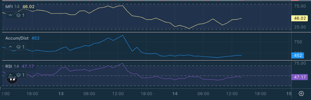
Let’s focus on the money flow indicators: Money Flow Index (MFI) and Accumulation/Distribution (A/D) and analyse the BTC/USD 1-hour chart on March 11, 2026.
At first glance, price appears to be trending gradually higher, recovering from the earlier dip and pushing toward the $70,000 region.
- Price: $69,921 – Market stabilising after upward move.
- MFI: 33 – Weak short-term buying pressure
- A/D: Rising steady – Continued accumulation pressure
Price has moved higher, yet the Money Flow Index remains relatively low, sitting near the lower half of its range.
The MFI reflects short-term buying pressure. A reading around 33 suggests that recent inflows are relatively modest.
The Accumulation/Distribution line, however, continues to trend upward. Because A/D is a cumulative indicator, it captures the broader pattern of capital flow over time.
In this case, it suggests that buying pressure has been gradually building across multiple candles, even if short-term momentum has cooled. This combination can often appear during consolidation within an uptrend. Short-term momentum slows down, causing the oscillator to fall, while the cumulative indicator continues to rise as buyers quietly absorb supply. For traders, this kind of setup can signal that the market is pausing rather than reversing, with accumulation still occurring beneath the surface.
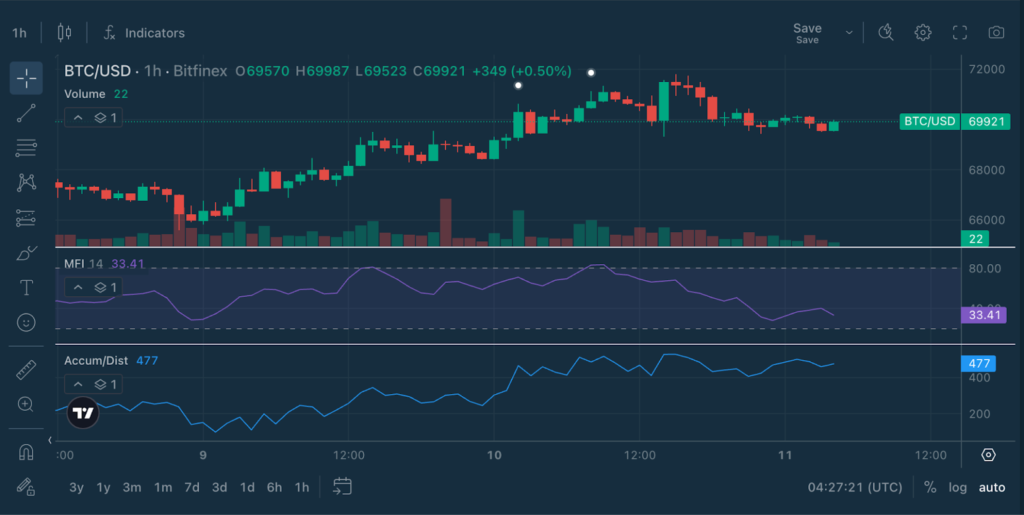
Bonus Read: How the 1-Hour Chart Fits Inside the 4-Hour Trend
As we go to the 4hr chart, the price is currently trading around $70,095, after recovering from the dip earlier in the week and moving back toward the upper part of the recent range.
- Price: $70,095 – Recovering toward resistance
- MFI: 74 – Strong buying pressure approaching overbought
- A/D: Flattening – Longer-term distribution stabilising
Right now, that context looks like a recovery with buying pressure increasing but long-term capital flow stabilised.
Why the Two Timeframes Can Look Different
It is common for lower and higher timeframes to show different signals at the same time.
In this case:
- The 1-hour chart shows that within the larger 4-hour recovery, short-term buying pressure is helping price recover.
- The 4-hour chart shows that longer-term capital flow is still cautious.
In other words, short-term traders are pushing the price upward, but the broader market has not yet fully committed to a new trend.
Professional Trading Strategies with MFI
1. Trend Confirmation
MFI can help confirm whether a trend is supported by genuine buying or selling pressure.
- In an uptrend, rising MFI suggests strong capital inflows, reinforcing the strength of the move.
- In a downtrend, falling MFI indicates persistent selling pressure, confirming bearish momentum.
When price trends but MFI weakens, it may signal that the trend is losing participation.
2. Breakout Validation
Breakouts supported by strong money flow tend to be more reliable.
- If price breaks resistance while MFI rises sharply, it suggests new capital is entering the market and the move may sustain.
- However, if price breaks out while MFI remains flat or declines, the move may lack conviction and could fail.
3. Detecting Early Reversals
One of the most valuable signals from MFI is divergence.
- When price continues making new highs but MFI begins falling, buying pressure may be weakening beneath the surface.
- Conversely, if price makes new lows while MFI begins rising, it can indicate that selling pressure is fading.
These divergences often appear before price reversals, giving traders early signals of momentum shifts.
4. Multi-Indicator Confirmation
Professional traders rarely rely on a single indicator. MFI becomes more powerful when combined with other tools.
MFI + RSI
RSI measures momentum while MFI confirms whether volume supports the move.
Example:
- RSI moves above 70 while MFI also rises strongly → momentum and buying pressure are aligned.
- RSI becomes overbought but MFI fails to rise → momentum may be weakening and the move could lose strength.
MFI + VWAP
VWAP highlights the market’s average traded price, while MFI reveals whether capital inflows are strengthening around that level.
Example:
- Price reclaims VWAP while MFI begins rising → buying pressure is strengthening near an important level, suggesting demand may be entering the market.
- Price trades below VWAP while MFI continues falling → selling pressure remains dominant.
MFI + MACD
MACD signals momentum shifts, while MFI confirms whether those shifts are supported by capital flows.
Example:
- MACD bullish crossover + rising MFI → momentum shift supported by increasing buying pressure.
- MACD crossover while MFI stays flat or falls → the signal may lack conviction.
Used together, these indicators help traders identify moves backed by both momentum and participation.
Setting It Up on Bitfinex
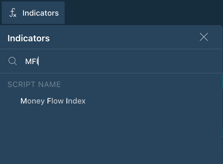
To add the Money Flow Index to your chart:
- Log into Bitfinex
- Select any trading pair
- Click Indicators
- Search for Money Flow Index
(The default setting is 14 periods, though traders often adapt it to their strategy and timeframe) - Leverage Bitfinex’s zero trading fees to implement your MFI strategies
Watch how MFI behaves during breakouts, pullbacks, and consolidation phases.
Explore the full Chart Decoder library:


Be the first to comment