


COVID, wars, inflation, ETFs, and banking crises changed the headlines. Bitcoin’s bull-market geometry remained remarkably similar.
Markets are supposed to react to information.
A pandemic should not produce the same market behavior as a banking crisis. A world flooded with stimulus should not resemble a world dominated by high interest rates. Different events should create different outcomes — at least, that is what financial narratives teach us.
But when I compared Bitcoin’s two largest bull markets, I found something unexpected. The headlines changed. The geometry barely did.

Two Different Worlds
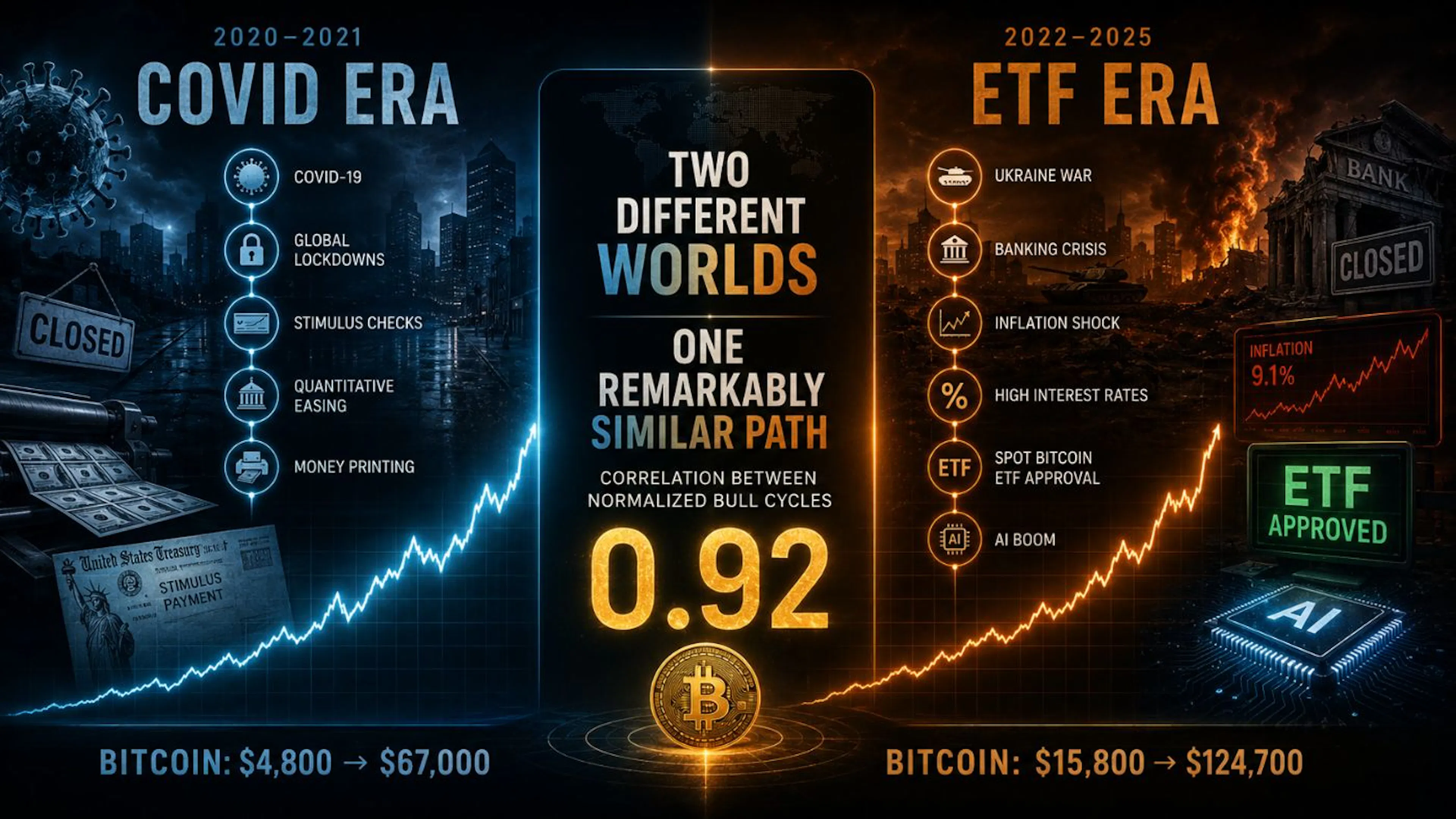 Figure 1 — Two Different Worlds. The first cycle developed during COVID-era stimulus and quantitative easing; the secondunfolded amid wars, inflation shocks, banking crises, and Bitcoin ETF approvals.
The first cycle emerged during one of the most extraordinary periods in modern economic history.
2020–2021 — The world experienced:
- COVID-19
- Global lockdowns
- Quantitative easing
- Trillions in stimulus
- Aggressive monetary expansion
Bitcoin rose from approximately $4,800 to over $67,000.
The second cycle emerged in a completely different environment.
2022–2025 — The world experienced:
- The Ukraine war
- Banking-sector instability
- Inflation shocks
- High interest rates
- Spot Bitcoin ETF approvals
- The AI investment boom
Bitcoin rose from approximately $15,800 to over $124,700.
From a macroeconomic perspective, these were two different worlds: different policies, different risks, different narratives, different headlines. Yet the market left behind a surprisingly familiar fingerprint.
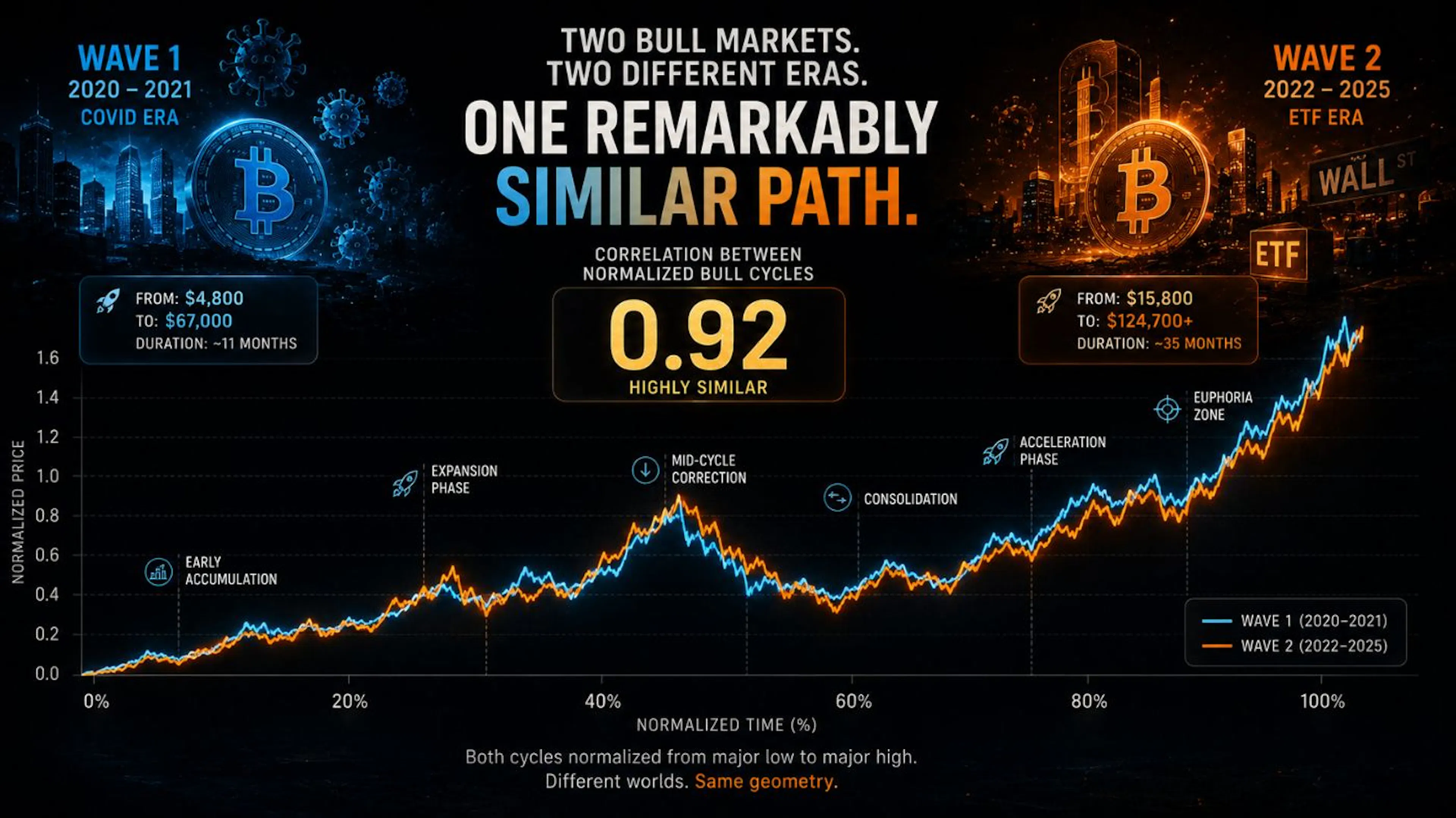 Figure 2 — One Remarkably Similar Path. After normalizing both cycles from major low to major high, the two bull marketsproduced a geometric correlation of roughly 0.92–0.95, despite radically different external conditions.
Comparing raw prices would be meaningless. One cycle peaked near $67,000; the other above $124,700. Instead, both cycles were normalized from major low to major high. This removes scale and focuses exclusively on structure.
The result was surprising. The two paths produced a correlation of approximately:
0.92
Not identical. Not perfect. But remarkably similar for two market cycles separated by years and shaped by completely different global events.
The rallies accelerated at similar stages. The corrections emerged in similar locations. The recoveries followed comparable trajectories. The amplitudes changed; the geometry largely remained.
At this point, an obvious question emerges: was this merely a coincidence? Or was something deeper repeating beneath the headlines?
A Note on What 0.92 Does — and Doesn’t — Mean
Before going further, the correlation figure deserves an honest caveat. When two series are each normalized from a major low to a major high, both are, by construction, rising curves that start near zero and end near one. Rising curves tend to correlate strongly with one another almost automatically — so a high number, on its own, is not yet proof of a shared hidden structure.
This is a well-known trap in time-series analysis, sometimes called spurious correlation. The responsible way to read 0.92, then, is not as a finished verdict but as a starting observation: the two paths are similar enough, in shape and in the placement of their turning points, that the resemblance is worth examining rather than dismissing.
What makes the similarity more interesting than a generic upward drift is not the headline number but where the structure lines up — accelerations, corrections, and consolidations appearing at comparable stages of each cycle. Those are the features a simple rising trend would not reproduce on its own.
In short: 0.92 is the question, not the answer. Later in this article, I put that question to a direct statistical test.
Bitcoin Doesn’t Repeat Prices. It Repeats States.
Most investors focus on price. Markets revisit support levels, resistance levels, previous highs, previous lows. But prices are only the surface layer.
Complex systems often revisit behaviors long before they revisit values, and the same may be true for markets. A market trading at $20,000 and a market trading at $120,000 can still occupy similar dynamic states. Prices differ; behavior does not.
To explore this possibility, I examined Bitcoin using recurrence analysis.
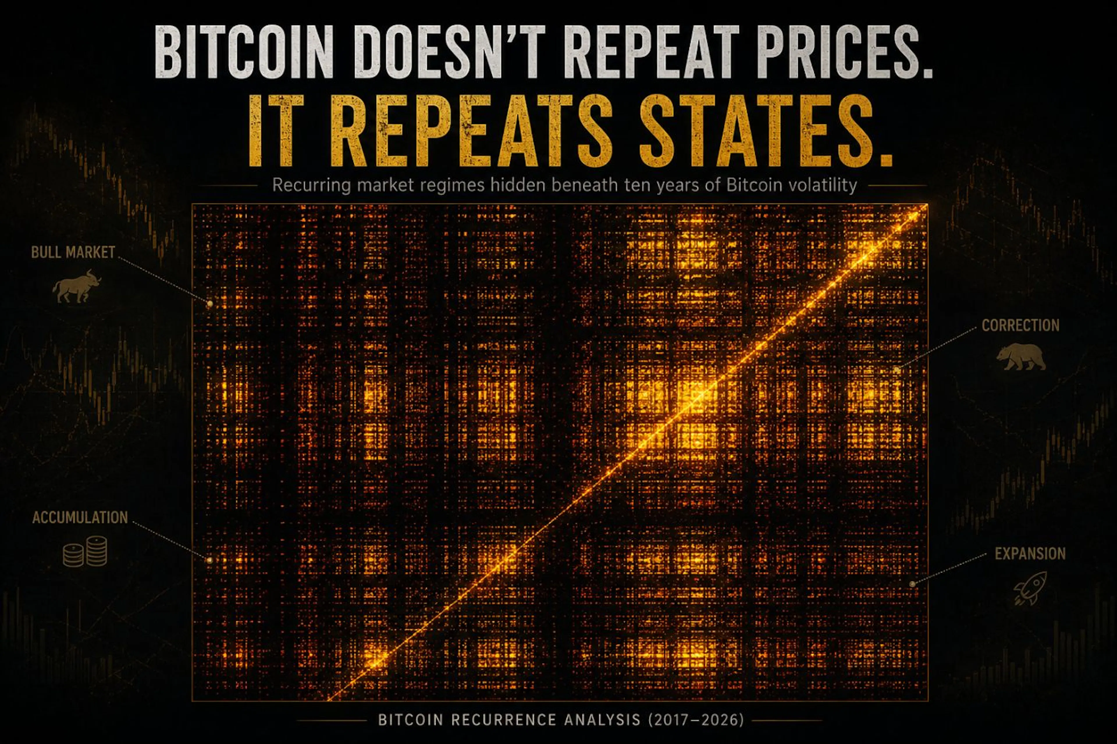 Figure 3 — A recurrence plot of Bitcoin’s embedded return dynamics (2017–2026). Bright clusters indicate periods where themarket revisited similar dynamic regimes despite occurring at different times, prices, and news environments.
A recurrence plot measures how often a system returns to similar dynamic configurations. If Bitcoin behaved like pure noise, the image would look largely random. Instead, distinct clusters and recurring structures appear throughout the chart.
These patterns suggest that Bitcoin repeatedly revisits similar market regimes despite occurring at different times and price levels — expansion, correction, consolidation, acceleration. Markets may not revisit the same prices, but they often revisit the same states. This observation does not prove predictability, but it does suggest structure — and structure is the opposite of randomness.
The Geometry Beneath the Headlines
To investigate the structure further, I reconstructed Bitcoin’s behavior in phase space.
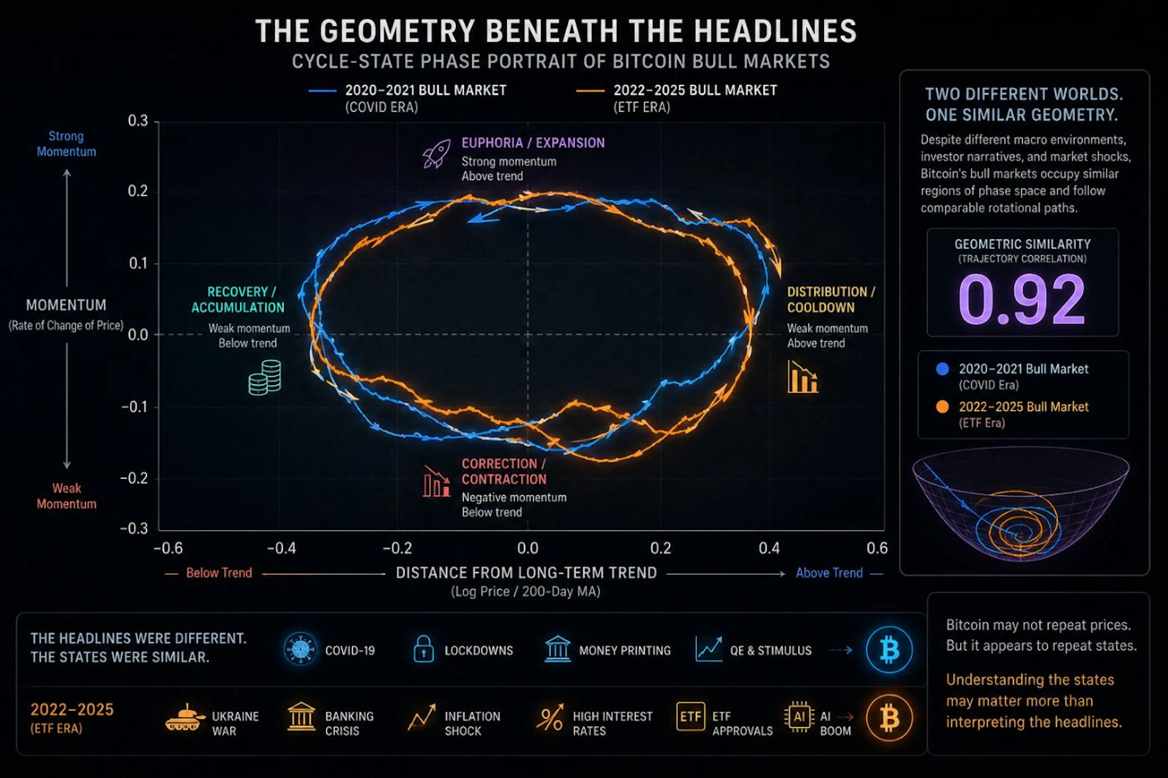 Figure 4 — A phase-space representation of Bitcoin’s market dynamics. Rather than tracking price directly, this maps therelationship between trend deviation and momentum, revealing recurring geometric trajectories beneath changing market
Rather than tracking price directly, this approach tracks relationships between market variables — in this case, distance from the long-term trend and market momentum.
The resulting trajectories reveal something notable. The two bull markets occupy similar regions of phase space. They move through similar configurations. They rotate through similar behavioral states. Again, the external world changed dramatically. The underlying geometry changed far less.
Technical Validation
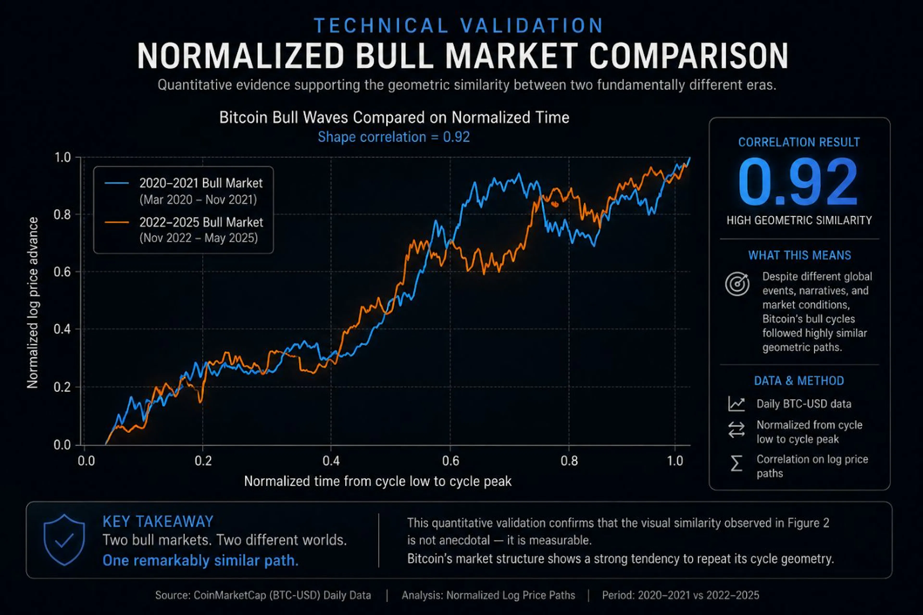 Figure 5 — Quantitative validation. After normalizing both bull-market cycles on a common time scale, the resulting log-pricepaths exhibited a correlation of roughly 0.92–0.95.
Visual similarity alone is not evidence. The comparison shown earlier was tested quantitatively using normalized log-price trajectories. The resulting correlation was approximately 0.92 to 0.95, depending on the exact cycle endpoints chosen.
But as I flagged earlier, a high correlation between two rising curves is not, by itself, proof of anything. So I ran the test the skeptic would demand.
Putting 0.92 to the Test: Is It Better Than Chance?
If two normalized uptrends correlate strongly just because they both rise, then the only way to know whether Bitcoin’s resemblance is meaningful is to ask: how strongly do comparable random uptrends correlate? If random rising curves also hit 0.92, the number is meaningless. If they don’t, it isn’t.
So I built the null distribution directly. Using twelve years of daily Bitcoin data (2014–2026), I generated thousands of pairs of comparable price paths under three increasingly strict benchmarks, normalized each pair exactly as the two real cycles were normalized, and measured their correlations.
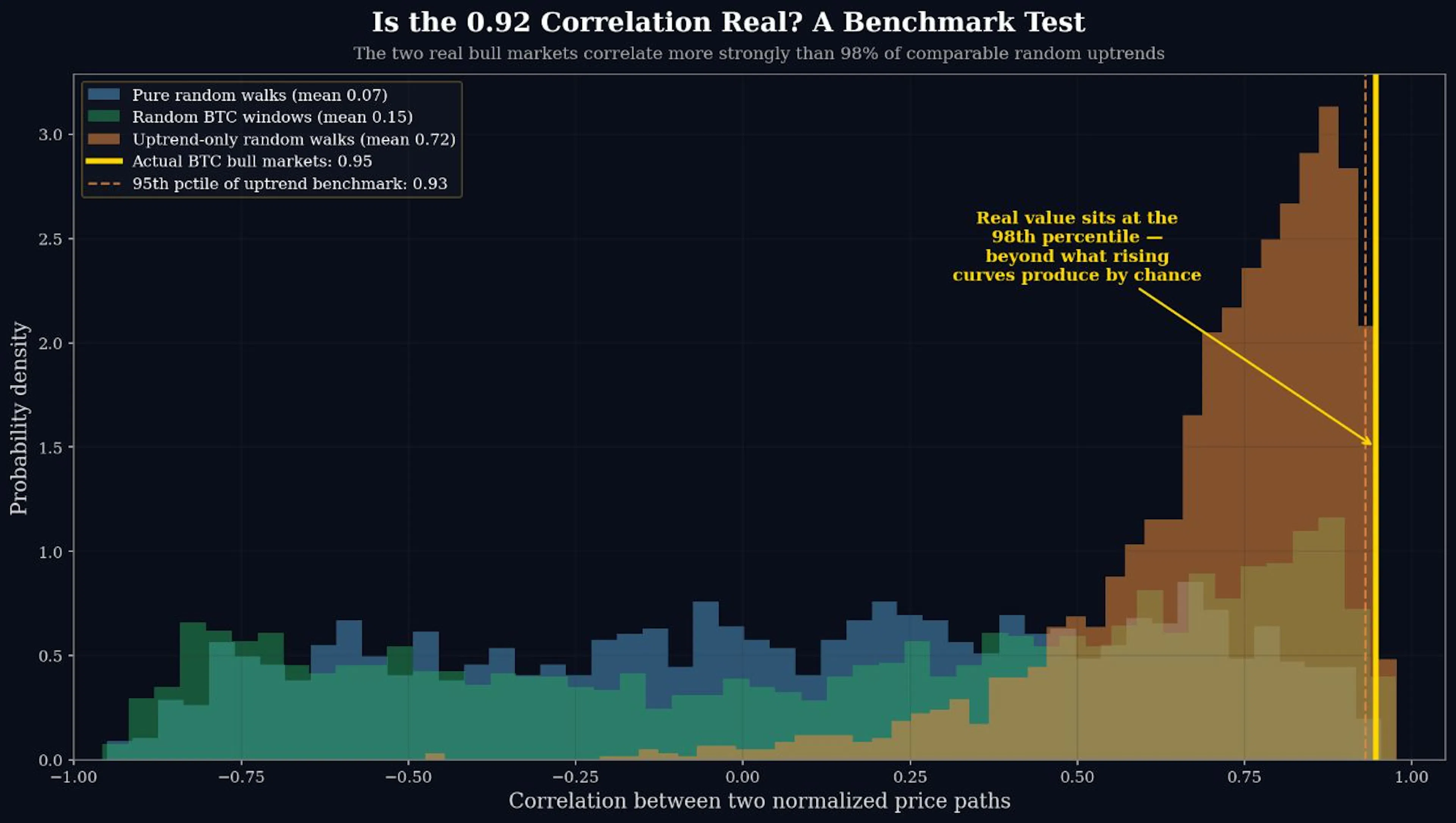 Figure 6 — Benchmark test of the bull-market correlation. The actual correlation between Bitcoin’s two bull markets (goldline, 0.94) is compared against three null distributions: pairs of random walks (blue, mean 0.07), random windows of real
The results are worth stating precisely:
- Against pairs of pure random walks, the average correlation was just 0.07. The real 0.94 is essentially off the chart.
- Against random windows of real Bitcoin history, the average was 0.15. The real value lands at the 99th percentile.
- Against the toughest, fairest benchmark — random walks conditioned on being uptrends — the average correlation was 0.72. This confirms the honest caveat from earlier: a large part of any two rising curves’ similarity really is just an artifact of both rising. But the real bull-market correlation of 0.94 still sits at the 98th percentile of that distribution.
That is the result that turns an observation into a finding. Part of the resemblance is indeed the trivial consequence of comparing two uptrends — exactly as the skeptic would warn. But Bitcoin’s two cycles resemble each other more closely than 98% of comparable random uptrends do. The excess is real, and it is statistically significant (roughly p ≈ 0.02).
In plain language: the similarity is stronger than chance alone would produce. It is measurable, not anecdotal.
Why This Matters
Financial commentary often treats markets as reactions to events. An event occurs, a narrative forms, an explanation follows. But narratives are usually retrospective — they explain what already happened.
Geometry asks a different question. Instead of asking what happened? it asks what structure emerged? The distinction matters, because if markets repeatedly revisit similar states, understanding those states may be more valuable than endlessly interpreting headlines.
News still matters. Volatility still matters. Macro conditions still matter. But they may not be the entire story.
Limitations
This study does not prove that Bitcoin is a strange attractor. It does not demonstrate deterministic behavior, and it does not imply that future bull markets must resemble previous ones.
It rests on only two completed bull-market cycles. Two is enough to measure a resemblance and test it against a benchmark — which is what I have done — but it is not enough to claim a universal law. A third or fourth cycle could weaken the pattern, or strengthen it.
The phase-space and recurrence views are interpretive tools, not proofs of determinism. And the benchmark test, while it rules out the most obvious spurious explanation, cannot rule out every possible confound.
What survives all these caveats is concrete: across two cycles shaped by radically different macro environments, Bitcoin traced geometrically similar paths — and that similarity exceeds what comparable random uptrends produce 98% of the time. Future cycles may diverge. The geometry may eventually break. But the persistence observed so far is difficult to dismiss as coincidence.
Final Thought
History remembers headlines.
Markets remember behavior.
The stories changed.
The participants changed.
The macro environment changed.
Yet the geometry remained remarkably familiar.
Perhaps markets are not driven solely by news.
Perhaps they are also shaped by recurring patterns of human behavior.
The world delivered different news.
Bitcoin delivered the same geometry.
Methodology and reproducibility: Daily BTC-USD prices, 2014–2026 (4,537 observations). Bull markets defined as Mar 2020–Nov 2021 and Nov 2022–May 2025. Both cycles normalized from cycle low to cycle high on log price and resampled to a common length before computing the Pearson correlation. The benchmark null distributions were generated from 2,000 pairs each of: random walks (matched to Bitcoin’s daily drift and volatility), random windows of actual Bitcoin history, and uptrend-conditioned random walks. The analysis is descriptive, identifies a statistically significant resemblance rather than causation, and is not investment advice.



Be the first to comment