



The Solana logo is one of the most recognizable symbols in the cryptocurrency industry. Its distinctive design consists of three stacked parallelograms and uses Solana’s signature purple and green color palette.
But what do the Solana logo and colors actually represent, and why did the blockchain originally have a different name?
What Is the Solana Logo?
The Solana logo is a simple geometric mark made up of three stacked parallelograms. Its angular design and gradient of purple and green give it a distinctive visual identity closely associated with the Solana blockchain.
Sponsored

Crypto Prediction Markets
18+ · Gambling involves risk. Play responsibly.
According to Solana’s official brand guidelines, the design is inspired by 1980s tech aesthetics, while the three parallelograms convey a sense of speed and celebrate the concept of building.
The three stacked parallelograms convey a sense of speed while celebrating the concept of building. Both Solana Labs and the Solana Foundation use this logo.
The Solana (SOL) logo, letter logo, and other branding materials are available on the Solana Branding site in various formats, like SVG and PNG, along with usage guidelines.
What Does the Solana Logo Mean?
The three-parallelogram Solana logo conveys speed and the concept of building, according to Solana’s official brand guidelines.
Its geometric design and purple-to-green gradient have since become closely associated with the Solana ecosystem.
What Are the Solana Colors?
The official Solana colors are Solana Purple (#9945FF) and Solana Green (#14F195), two distinctive colors used across the blockchain’s visual identity.
The Solana logo combines these colors in a gradient, creating its recognizable purple-to-green appearance.
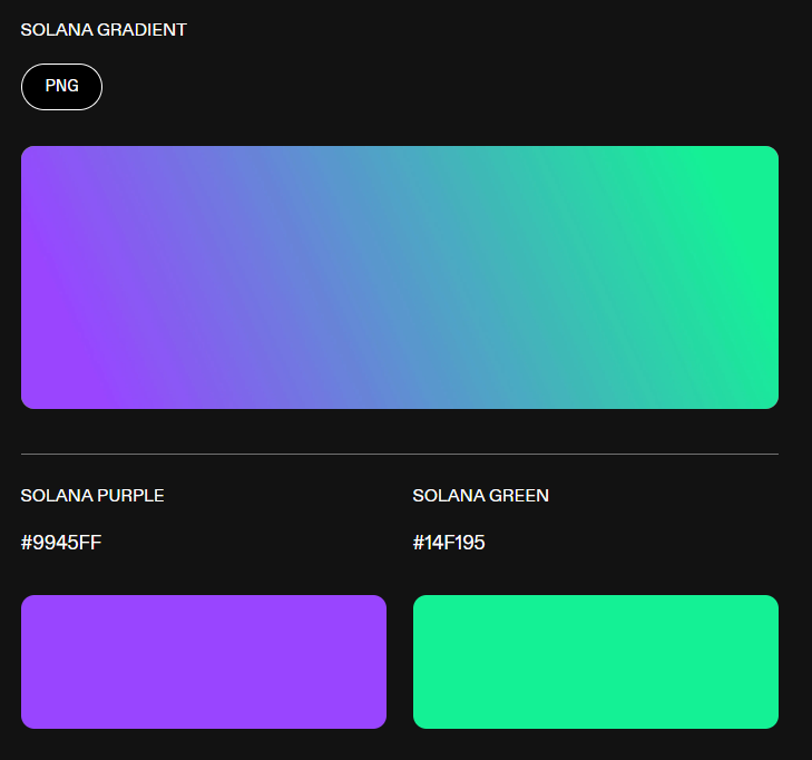
Together, the Solana colors are closely associated with the network’s brand and are featured in its official logo, website, and other visual assets.
| Color | HEX |
| Solana Purple | #9945FF |
| Solana Green | #14F195 |
The Solana brand uses a distinctive gradient combining Solana purple (#9945FF) and Solana green (#14F195). These are the official colors currently listed in Solana’s brand guidelines.
Why Does the Solana Logo Have Three Shapes?
The Solana logo consists of three stacked parallelograms that form the network’s distinctive symbol. According to Solana’s brand guidelines, the design conveys a sense of speed and celebrates the concept of building.
The three shapes, combined with Solana’s signature purple-to-green gradient, create a recognizable visual identity that represents the fast-moving nature of the Solana ecosystem.
What Was Solana Originally Called?
Solana was originally called Loom. Co-founder Anatoly Yakovenko and his team were developing the blockchain and its Proof-of-History consensus mechanism when they discovered that an Ethereum-based project was already using the Loom name.
To avoid confusion, the founders chose a new name: Solana, inspired by Solana Beach in Southern California, where Yakovenko and his colleagues often surfed while working on the project.

Can You Use the Solana Logo?
Solana provides official logo assets and brand guidelines for use in communications and other materials.
Anyone using the logo should follow the applicable brand guidelines and avoid modifying the mark or creating the impression of an official endorsement or partnership.
The logo should not be altered, stretched, recolored, or used in a way that could suggest an official partnership or endorsement. For the latest logo files, usage rules, and brand assets, refer to Solana’s official branding resources.
Has the Solana Logo Changed?
The Solana logo has evolved alongside the blockchain’s brand, but its distinctive three-parallelogram symbol has remained at the heart of its visual identity.
Solana’s official brand guide still uses the familiar logomark together with the Solana wordmark and its signature purple and green colors.
There are different versions and lockups of the logo for different uses, but the core three-parallelogram design remains unchanged in Solana’s current branding.
FAQs
The official Solana colors are Solana Purple (#9945FF) and Solana Green (#14F195). Solana also uses a gradient combining these two colors.
The Solana logo is typically shown using the brand’s purple and green gradient, although the official brand assets are also available in other formats and applications.
The Solana logo consists of three identical parallelograms stacked together. According to Solana’s official brand guidelines, the design conveys speed and the concept of building.
The three-parallelogram Solana symbol represents speed and building, reflecting the network’s focus on performance and development.
The official hex code for Solana Purple is #9945FF. Solana’s other primary brand color, Solana Green, is #14F195.
Solana was originally called Loom (or Loom Protocol). The project was renamed Solana to avoid confusion with the existing Ethereum-based Loom Network. The name Solana was inspired by Solana Beach, California.
Solana provides official PNG and SVG logo assets for use in communications and other materials, along with brand guidelines. The guidelines specify how the logo should be displayed, including restrictions against stretching it, adding shadows or outlines, or using it in low resolution.






Be the first to comment